
Introduction: The Wow Stone That Can Go Wrong Fast
You walk into a showroom and there it is: Orobico Rosso marble, all movement and color, like a geological painting that forgot it was supposed to behave. A homeowner with a warm-minimal living room vision points at the slab and says, “That one.” The designer smiles… and immediately imagines the aftershock: a room that feels smaller, noisier, and visually restless.
This guide is for using Orobico Rosso as a statement material with control. Not “tone it down until it’s boring,” but “let it speak without shouting.” You’ll get practical placement rules, slab-planning strategies, finish and lighting logic, realistic material parameters, and quantified design guardrails (percent coverage, kg/m² weight planning, and traction notes for floors).
Why Orobico Rosso Feels Like a Statement Stone
Orobico Rosso has high “attention gravity” because it combines three things modern interiors rarely get from one material: strong color presence, high-contrast veining, and large-scale movement. In a neutral room, the eye naturally snaps to it first. That’s exactly why it works as a focal point—and exactly why it overwhelms when it’s treated like a background finish.
The most common mistake is using it the way you’d use a calm stone: too much surface area, too many competing patterns nearby, and no framing strategy. The result is not “luxury”; it’s visual traffic.
Know the Stone Before You Design Around It
Orobico Rosso is often listed under related naming families such as Arabescato Orobico Rosso, Rosso Orobico, or Red Arabescato. In real-world sourcing, naming differences can mean different quarries, blocks, or even simply different marketing labels. For design, the key point is consistency: batch-to-batch variation is normal for dramatic marbles, so slab selection and approval matter as much as the “name.”
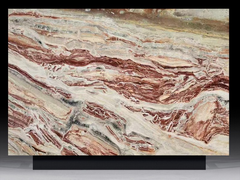
Material parameters to request before you commit
Ask for batch test reports and fabrication notes, not just brochure claims. For a marble in this category, typical reference ranges you may see on supplier test sheets include:
-
Density: around 2600–2800 kg/m³
-
Water absorption: often around 0.10–0.30%
-
Flexural strength: commonly around 8–15 MPa (varies by test method and thickness)
-
Mohs hardness: around 3 (marble baseline)
-
Thickness: 20 mm and 30 mm are common for slabs; thinner panels exist but require engineered backing and installation planning
These ranges aren’t promises; they’re planning numbers. The project-grade truth is the test report for the specific batch you’re buying.
Weight planning that keeps you out of installation trouble
A simple, design-friendly calculation helps you anticipate handling and anchoring needs:
kg/m² = density (kg/m³) × thickness (m)
If you assume 2700 kg/m³ as a planning density:
-
20 mm (0.02 m) ≈ 54 kg/m²
-
30 mm (0.03 m) ≈ 81 kg/m²
That difference changes everything: wall substrates, lifting equipment, shipping risk, and even how confidently you can specify large-format vertical panels.
Table: Material parameter checklist
| Item | Target to request | Why it matters |
|---|---|---|
| Density (kg/m³) | Batch report value | Weight planning, anchoring, handling |
| Water absorption (%) | Batch report value | Stain risk planning and sealer strategy |
| Flexural strength (MPa) | Batch report value | Panel sizing, spans, break risk |
| Thickness (mm) | 20 / 30 or engineered panel | Stability and visual depth |
| Finish | Honed / polished / brushed | Light behavior and daily wear visibility |
| Resin/fill notes | Disclose treatments | Color consistency, repairability |
| Recommended sealer type | Brand-neutral spec | Maintenance planning and performance expectations |
The Don’t-Overwhelm Rulebook Designers Actually Use
These rules are written to be executed, not admired.
One hero surface per sightline
A sightline is a primary view axis: entry-to-living, sofa-to-TV wall, dining-to-feature wall. Within one sightline, you get one dominant visual statement. If Orobico Rosso is that statement, everything else in that sightline should be calmer.
Control the frame
Orobico Rosso needs a border strategy so it reads as intentional architecture, not uncontrolled pattern. “Frame” can mean a recessed wall niche, a matte surround paint, a thin metal trim, or a clean edge profile that stops the veining from bleeding into adjacent surfaces.
Reduce pattern competition
If Orobico Rosso is present, limit other “busy” elements: strong wood cathedral grain, high-contrast terrazzo, graphic wallpaper, or heavily patterned rugs. You can keep texture—just keep it quiet.
Use negative space on purpose
This is the most underrated luxury move. Blank wall areas, calm cabinetry fronts, and simple ceilings are not “empty.” They are a deliberate buffer that makes the stone look more expensive.
Let lighting do the polishing, not chaos
Dramatic marble looks either like a curated gallery piece or like a messy collage depending on lighting. Your lighting plan is part of the stone specification.
Best Applications: Where Orobico Rosso Shines Without Taking Over
The best placements share a common trait: controlled surface area with high visibility.
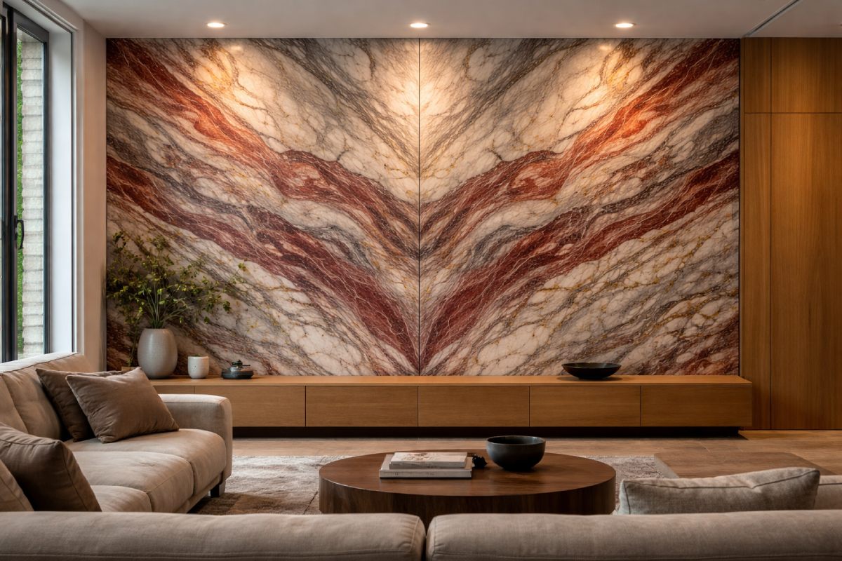
Feature wall: entry, TV wall, dining backdrop
Real scenario: an 85 m² apartment has an open living-dining zone. Instead of covering multiple walls, the designer uses a single Orobico Rosso panel composition behind the dining table, roughly 2.4 m wide by 2.7 m tall. The rest of the space stays warm-white and wood-forward. Result: the stone becomes “the memory,” not “the noise.”
Orobico Rosso marble feature walls work best when:
-
the wall is a natural focal point
-
the surrounding palette is simplified
-
the slab layout is planned so the movement looks composed
Fireplace surround: controlled drama, natural focal point
A fireplace already anchors attention. Orobico Rosso can amplify it without spreading chaos across the room. Use it as the surround and keep the remaining wall finish matte. If the room already has strong elements (dark beams, heavy art, bold upholstery), shrink the stone footprint rather than forcing balance through more contrast.
Powder room: small space, big payoff
Powder rooms are ideal because you can create a complete statement within a small envelope. A single wall behind the vanity, or a full-height backsplash with a clean mirror edge, gives maximum impact with limited coverage. A 2–3 m² powder room can feel like a boutique hotel moment when the stone is framed and the lighting is flattering.
Bathroom vanity and backsplash: high impact, manageable wear
Bathrooms allow statement stone with a more controlled exposure profile than kitchens. A honed finish usually reads calmer and hides micro-wear better. The design success factor here is maintenance realism: specify neutral cleaners and avoid aggressive acidic descalers on stone surfaces.
Kitchen backsplash or bar zone: the bold look without the heavy abuse
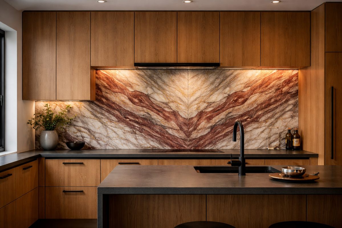
Orobico Rosso is often better on the backsplash, island cladding, or bar backsplash than on the main prep countertop. It delivers drama where people look, not where knives, acids, and high-frequency abrasion live. If you do choose it for countertops, the project must accept patina as part of the story.
Floors and stairs: define the boundary clearly
Orobico Rosso on floors is possible, but only when you respect traffic and slip risk. If you’re considering it:
-
Keep it to low-traffic, dry residential zones
-
Avoid wet entries, wet bathrooms, and high-traffic corridors
-
For stairs, prefer risers (vertical faces) over treads (walking surfaces)
If slip resistance must be quantified, many teams use dynamic friction frameworks as a planning reference. A commonly discussed target for interior wet conditions is a DCOF around 0.42 for certain hard-surface flooring categories, but marble performance is finish- and contamination-dependent and should be tested for the actual finished surface and use scenario. Treat DCOF numbers as a decision tool, not a guarantee.
Table: Application fit matrix
| Application | Fit level | Main risk | Design fix | Maintenance demand |
|---|---|---|---|---|
| Feature wall | High | Visual overload | One hero per sightline, framed edges | Low |
| Fireplace surround | High | Pattern competition | Matte surroundings, controlled footprint | Low–Medium |
| Powder room wall | High | Small space clutter | Negative space, simple fixtures | Medium |
| Vanity top + backsplash | High | Cleaner damage, etching | Honed finish, neutral cleaning plan | Medium |
| Kitchen backsplash | High | Grease staining | Sealer strategy + wipe discipline | Medium |
| Bar backsplash/cladding | High | Splashes, fingerprints | Honed, controlled lighting | Medium |
| Low-traffic dry floor | Medium | Scratches, slip risk | Choose finish carefully, test traction | Medium–High |
| Stair treads | Low | Slip and edge wear | Avoid or engineer traction strategy | High |
Finish Strategy: Honed vs Polished for a Bold Marble
Finish is not just “look.” It’s behavior.
Honed finish: modern calm and higher daily tolerance
Honed Orobico Rosso diffuses reflections. That reduces the “spotlight effect,” where every small mark becomes visible. It also photographs beautifully in warm minimalism and modern classic interiors because the stone reads as texture, not glare.
Recommended placements:
-
feature walls
-
vanity tops
-
backsplash zones
-
powder rooms
-
bar cladding
Polished finish: controlled drama, best on vertical planes
Polished Orobico Rosso can look spectacular, but it’s less forgiving. Reflections can exaggerate visual busyness and make water marks and residue more noticeable. If you choose polished, keep it on vertical, low-touch areas and design lighting to avoid harsh hotspots.
Recommended placements:
-
accent walls with controlled lighting
-
low-touch lobby features
-
fireplace surrounds (if cleaning protocol is disciplined)
Table: Finish comparison
| Finish | Visual impact | Mark visibility | Best use | Risk profile |
|---|---|---|---|---|
| Honed | Calm, premium | Lower | Most modern interiors | Safer |
| Polished | Dramatic, glossy | Higher | Vertical statements | Needs discipline |
| Brushed/leathered | Textured, tactile | Medium | Feature moments | Requires sampling |
Slab Planning That Makes It Look Premium
The same stone can look “luxury” or “random” depending on layout.
Bookmatch vs vein-match vs composed-random
Bookmatch is powerful in symmetrical spaces: centered fireplaces, formal dining walls, balanced lobbies. In asymmetrical modern spaces, bookmatch can feel too formal. Vein-match or composed-random often looks more contemporary because it keeps movement but avoids mirror-like drama.
Vein direction rules that shape the room
-
Vertical movement tends to make walls feel taller and more “gallery-like”
-
Horizontal movement can calm the room and widen the feel
-
Diagonal movement is highly energetic and can overwhelm faster; use it only when the surroundings are very quiet
Large format panels reduce visual noise
Large panels reduce grout lines and visual segmentation. For a statement stone, fewer interruptions usually equals a more expensive look.
Pairing Strategy: Colors and Materials That Calm Orobico Rosso Down
The goal is not to hide the stone. The goal is to give it a quiet stage.
Wall colors that don’t fight red-veined stone
The safest palette families:
-
warm whites that don’t go icy
-
soft greige tones
-
clay neutrals and muted taupes
Avoid pairing with high-saturation reds or oranges in the same sightline. That creates color competition and makes the stone feel less intentional.
Wood and metal pairings that feel designed, not accidental
-
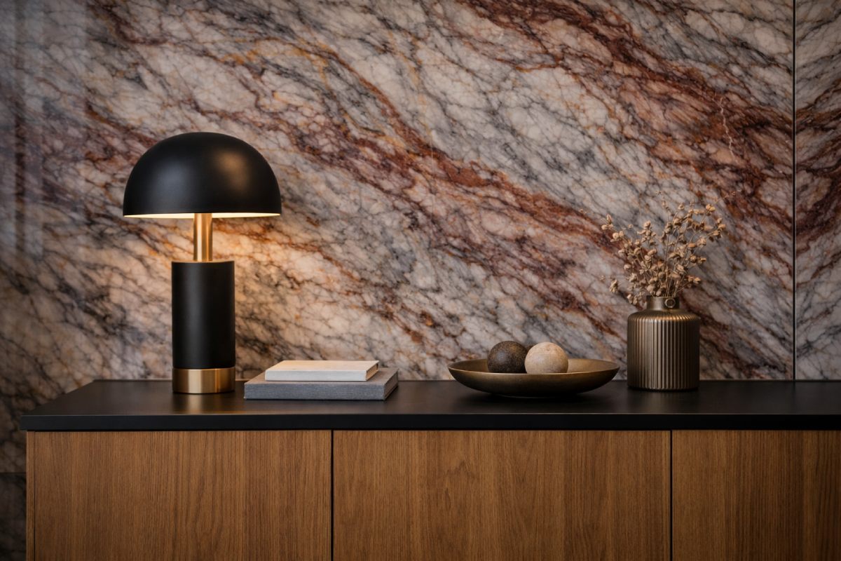
Oak: lighter, airy, modern
-
Walnut: deeper, calmer, more anchored
-
Brushed brass: warms the stone and makes it feel boutique
-
Matte black: adds order and linear control
Matte surroundings beat glossy surroundings
Glossy cabinetry, glossy paint, and high-gloss floors increase reflection competition. When the stone is already visually active, matte surrounding finishes usually create a calmer, more premium result.
Quantified Design Controls That Keep the Room Balanced
These numbers are practical guardrails. They help you and the client agree on what “too much” means before installation.
Statement coverage guideline: 5% to 12% as a default zone
A workable starting point is keeping Orobico Rosso’s visible area around 5%–12% of the combined visible wall-and-floor envelope in a room. In larger luxury spaces or commercial lobbies, you might push toward 15%, but only if you dramatically reduce competing patterns and keep lighting controlled.
Contrast budget: one dominant pattern, one supporting pattern
If the stone is the dominant pattern, allow only one supporting pattern (usually wood grain). Everything else becomes quiet: fabric, wall texture, flooring, ceiling.
Lighting numbers that preserve luxury
For residential interiors, warm lighting often makes Orobico Rosso look richer and less aggressive:
-
Ambient lighting: 2700–3000K
-
Color rendering: CRI 90 or higher is a smart target for accurate stone tones
-
Wall washing: placing a wash source roughly 30–60 cm from the wall can help create a smooth “light curtain” that makes veining feel intentional rather than chaotic
Practical Spec and Maintenance Notes: Keep It Real
A statement marble specification is incomplete without an honesty clause.
Etching and patina are normal marble behaviors
Marble is chemically sensitive to acids. That means etching can happen even when the stone is sealed. Sealing helps with stain resistance, not acid reaction. If a project demands a surface that stays visually identical under heavy use, Orobico Rosso should be moved to vertical zones or low-abuse areas.
Sealer logic and maintenance discipline
A reasonable planning approach is to treat sealing as part of the maintenance system, not a one-time event. High-use zones may need performance checks on a typical planning interval of 12–24 months depending on the environment and cleaning habits. Avoid abrasive powders and avoid acidic cleaners.
Installation details that change the outcome
Even perfect stone can look cheap if installation is sloppy. The key visual controls:
-
joint alignment and consistent seam decisions
-
clean, intentional edge profiles
-
substrate flatness to avoid stress points
-
layout mockups to approve veining flow before final fixing
Industry Requirements and Compliance Considerations
This section is written in buyer-friendly language because compliance is now part of premium design delivery.
Documentation expectations are rising for commercial projects
Commercial owners increasingly ask for clearer documentation: intended use statements, basic performance reports, and traceability confidence. This is especially true for hospitality and public interiors where safety and durability become operational concerns, not just design preferences.
Slip strategy matters if you place it underfoot
If Orobico Rosso goes on floors, you should treat traction as a design variable. In wet or transitional zones, rely on a traction strategy (finish choice, entry mat planning, maintenance protocol) and, when needed, test the finished surface under relevant methods rather than assuming performance.
Worker safety: dust control is not optional when cutting stone
Stone cutting and grinding can generate respirable dust that requires control strategies on many job sites. A practical design response is to specify more offsite prefabrication and minimize onsite cutting where possible.
Trends: Why Dramatic Marbles Are Back and How They’re Used Differently Now
Dramatic stones never truly left; they just stopped being used everywhere at once. The modern trend is curated intensity:
-
one focal surface rather than whole-room marble saturation
-
large panels with minimal joints
-
calmer surrounding palettes that let the stone read like art
-
lighting design treated as part of the material choice
Orobico Rosso fits this trend perfectly. It is naturally “content.” Used carefully, it delivers identity, brand feel, and memorability—especially in entry zones, dining backdrops, and boutique hospitality settings.
Conclusion: The Simple Framework That Keeps Orobico Rosso Elegant
Orobico Rosso is not a neutral material. It’s a statement by nature. The key is to design like you’re placing a masterpiece, not covering a surface. Choose one hero surface per sightline, frame it with quiet materials, plan the slab layout like a composition, and let lighting do the elegant work. Use quantified guardrails—coverage percentage, contrast budget, and lighting targets—so the client’s expectations match the material’s real behavior. Do that, and Orobico Rosso becomes a signature, not a takeover.
FAQ
1) How do you use Orobico Rosso marble as a statement without making the room feel busy?
The safest approach is to treat Orobico Rosso marble like a focal object instead of a background finish. Start by selecting one hero surface per primary sightline—typically an entry feature wall, a dining backdrop, or a fireplace surround—and keep the surrounding surfaces intentionally quiet. This “one hero per sightline” rule prevents the eye from bouncing between multiple dominant elements, which is the main reason statement materials feel overwhelming. Next, control the frame: use matte wall paint, clean edge profiles, or thin trims to visually contain the stone so the veining reads as composed rather than uncontrolled. Finally, simplify pattern competition. If the stone is visually active, limit strong wood grain, bold rugs, and graphic wall finishes within the same view. Many designers use a contrast budget: one dominant pattern (the marble) and one supporting pattern (often wood), with everything else staying low-contrast and matte. This approach keeps the space calm while letting the stone remain unforgettable.
2) Where are the best applications for Orobico Rosso marble in modern interior design?
Orobico Rosso marble performs best in high-visibility areas where the surface area is controlled. Feature walls are the top choice because they offer a strong statement without exposing the stone to heavy daily abuse. Fireplace surrounds are also excellent because the fireplace is already a natural focal point, and the stone can be framed with matte wall finishes to reduce visual noise. Powder rooms are another ideal application: a small room can carry a dramatic wall or full-height backsplash with minimal risk of “overload,” especially when the fixtures and wall colors are quiet and warm. In bathrooms, vanity tops paired with a backsplash are high-impact and manageable, particularly with honed finishes and a clear cleaning plan. In kitchens, the backsplash, island cladding, and bar backsplash are generally safer placements than the main prep countertop because the stone delivers the look without living in the highest-acid, highest-abrasion zone. Floors and stairs should be approached carefully and are usually best limited to low-traffic, dry residential areas if used at all.
3) Honed vs polished: which finish is safer for a bold marble like Orobico Rosso?
For most modern interiors, honed is the safer and more forgiving finish for Orobico Rosso marble. Honed surfaces diffuse reflection, which helps reduce the sense of visual chaos that can happen when a dramatic pattern is paired with strong glare. This also makes daily marks—light residue, fingerprints, minor wear—less noticeable, so the stone keeps its premium look longer in real-life conditions. Polished finishes can be spectacular, but they amplify reflections and can make water marks, cleaner residue, and small surface changes more visible, especially under directional lighting. If polished is chosen, it tends to perform best on vertical, low-touch surfaces such as feature walls, controlled lobby elements, or carefully lit fireplace surrounds. If the stone will be used on a vanity, backsplash, or bar zone that sees frequent contact and cleaning, honed typically offers a better balance of drama and long-term visual stability.
4) What colors and materials pair best with red-veined statement marble?
Orobico Rosso marble looks most intentional when it is paired with calm, warm neutrals and matte textures. Warm whites, soft greige tones, and clay neutrals tend to complement red-veined movement without creating color competition. For wood, oak gives a lighter, more modern feel, while walnut adds stability and depth that can “anchor” the stone visually. Metal accents can tune the mood: brushed brass warms the stone and leans boutique-luxury, while matte black adds structure and restraint, helping the veining feel organized rather than chaotic. The surrounding finish strategy matters as much as color. Matte paints, plaster-like wall finishes, microcement, and low-sheen cabinetry reduce reflection competition. When the surrounding surfaces are glossy, the room can feel visually louder because reflections multiply the stone’s movement. A simple rule is that the bolder the marble, the quieter and more matte the supporting materials should be.
5) Can Orobico Rosso marble be used on floors or stairs, and what should you check first?
Orobico Rosso marble can be used underfoot in some situations, but it requires careful boundary-setting and a traction-minded specification. The safest floor applications are low-traffic, dry residential zones where wear, contamination, and wetness are limited. Wet entries, wet bathrooms, and high-traffic corridors increase slip risk and maintenance burden, especially if polished finishes are used. For stairs, the risk is higher because the consequences of slipping are more severe; many designers prefer using the stone on stair risers (vertical faces) rather than on treads (walking surfaces). Before approving it for floors or stairs, check three things. First, finish choice: honed or textured finishes generally provide a calmer look and can improve practical grip compared to polished. Second, traction strategy: include entry mat planning, cleaning protocols, and—when needed—testing of the finished surface for the real use scenario. Third, maintenance and durability expectations: marble may scratch and show wear more readily than some alternatives, so the space must accept realistic upkeep. When these checks are done, Orobico Rosso can work, but it should never be treated as a default flooring material in wet or high-intensity environments.
References
-
Statement Surfaces in Contemporary Interiors: Visual Hierarchy and Focal Strategy, Design Research Team, International Interior Design Institute, Professional practice bulletin.
-
Natural Stone in Residential Design: Material Behavior and Client Expectation Management, Technical Advisory Group, National Stone Trade Association, Technical guidance note.
-
Marble Properties and Performance Ranges: Density, Absorption, and Strength in Building Use, Standards Working Panel, Building Materials Testing Consortium, Industry technical report.
-
Slip Risk in Hard-Surface Flooring: Friction Concepts, Wet Zones, and Maintenance Effects, Safety Engineering Unit, Pedestrian Safety Research Council, Applied safety review.
-
Lighting for Materials: Color Rendering, Glare Control, and Wall Washing Methods, Technical Committee, Professional Lighting Engineering Association, Lighting guidance memorandum.
-
Best Practices in Large-Format Stone Cladding: Substrate, Anchoring, and Tolerance Control, Facade Engineering Group, Architectural Envelope Society, Engineering practice paper.
-
Stone Fabrication Safety: Dust Control and Worksite Risk Reduction, Occupational Hygiene Unit, National Occupational Safety Authority, Safety standard commentary.
-
Vein Planning and Stone Layout Methods: Bookmatch, Vein-Match, and Composed Random, Stone Design Studio Team, Architectural Materials Workshop, Studio methodology paper.
Design Insight Overview
The key is hierarchy. Treat the marble as the room’s single dominant element within a primary view axis: entry-to-living, sofa-to-feature wall, or dining-to-backdrop. Everything else in that same sightline should be quieter in pattern and sheen. A practical rule is one hero surface per sightline and one supporting pattern (usually wood), with the rest kept matte and low-contrast. This keeps the stone memorable while the room remains restful.Why do some Orobico Rosso installations look premium while others feel chaotic?
Premium outcomes usually come from two invisible decisions: framing and lighting. Framing means the stone is visually contained by clean edges, trims, or calm adjacent finishes so the veining reads as composed. Lighting matters because high-glare reflections exaggerate contrast and make movement feel messy. Warm, high-quality illumination (typically 2700–3000K with high color rendering) and even wall-washing can turn “busy” veining into a deliberate composition.
What are the best application options for modern interiors, and what should you avoid?
The strongest options are feature walls, fireplace surrounds, powder-room statement walls, vanity + backsplash sets, and kitchen backsplash or bar cladding. These zones give high visibility with controlled surface area. Avoid treating Orobico Rosso as a default full-room finish, especially across multiple planes at once. If you want it underfoot, keep it to low-traffic, dry residential areas and design traction and maintenance as part of the decision, not an afterthought.
Option deep dive: honed vs polished finishes for a dramatic marble
Honed finishes reduce reflection “hot spots,” making bold veining feel calmer and everyday residue less visible—often the better match for warm minimalism and bright interiors. Polished finishes increase drama but also increase the visibility of marks and glare; they are best reserved for vertical planes where touch and wet contamination are limited. If the space has strong daylight or directional lighting, honed typically offers a more consistent look throughout the day.
Option deep dive: slab planning choices that change the entire result
Bookmatching can look gallery-grade in symmetrical settings (centered fireplaces, formal feature walls), but modern minimalist rooms often prefer directional calm through vein-matching or composed random layouts. Decide vein direction early: vertical movement can make walls feel taller, while horizontal movement can quiet the room. Large-format panels usually read cleaner than small tiles because fewer joints mean less visual noise.
Considerations: the quantified controls that keep the room balanced
Use measurable guardrails so the project stays predictable. Many bright interiors look best when Orobico Rosso is limited to roughly 5%–12% of visible wall-and-floor area, with the surrounding palette simplified. Plan weight and handling realistically (for example, 20 mm stone can be roughly 50+ kg/m² depending on density), and treat installation tolerances as a design feature: seam alignment, consistent joint width, and clean edge profiles are what make dramatic stone look intentional instead of random.
Considerations: compliance and site realities that buyers overlook
For floors and public-facing areas, traction expectations and maintenance protocols affect whether the stone remains safe and presentable over time. For fabrication and installation, dust control and prefabrication planning reduce site risk and improve finish consistency. In commercial projects, clearer documentation and intended-use statements help align design ambition with operational requirements. When these realities are addressed upfront, Orobico Rosso becomes a reliable signature material rather than a risky “wow factor.”