
Introduction: Minimalist Isn’t “White” — It’s Controlled Light
If minimalist interiors had a secret enemy, it wouldn’t be clutter. It would be uncontrolled light: glare that makes surfaces look harsh, veining that reads like visual noise, and a room that feels cold instead of calm. This is exactly where Bianco Statuario marble interior design can shine—when you treat it less like a “pretty white stone” and more like a lighting and contrast tool.
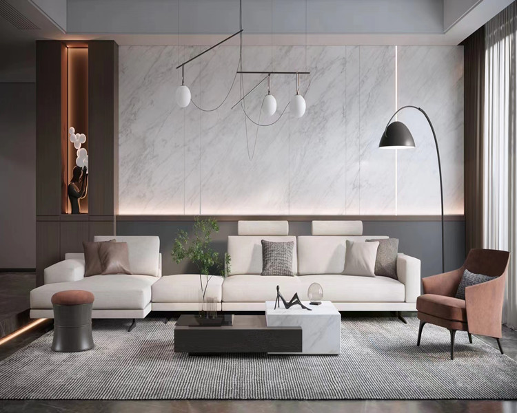
Bianco Statuario is famous for a reason: a bright white background with confident grey veining can create order in a space that might otherwise feel blank. The trick is using the stone to guide the eye, not to dominate it. Think of it as the lead violin in a minimalist orchestra: expressive, but only if the rest of the room isn’t also trying to solo.
The 3 Dials of a Bright Minimalist Space
Instead of starting with the usual “kitchen/bathroom/living room” list, start with three dials you can control. When these are tuned correctly, Bianco Statuario marble applications look intentional in any interior design style that leans bright and minimal.
Dial 1: Vein Noise (How Loud the Pattern Feels)
Veining is not just decoration; it’s movement. In minimalist spaces, movement can either add sophistication or create stress. With Bianco Statuario, you’ll see a range from quieter, finer veining to bold, dramatic strokes. The mistake is assuming “more dramatic = more premium.” In bright minimalist interior design, drama can quickly become visual clutter.
A practical rule: the smaller the room, the quieter the veining should be. Tight bathrooms, narrow galley kitchens, compact entryways—these spaces amplify pattern. Large open-plan living areas and wide feature walls can handle bolder veining because there’s enough negative space for the eye to rest.
Dial 2: Reflection (How Hard the Surface Throws Light Back)
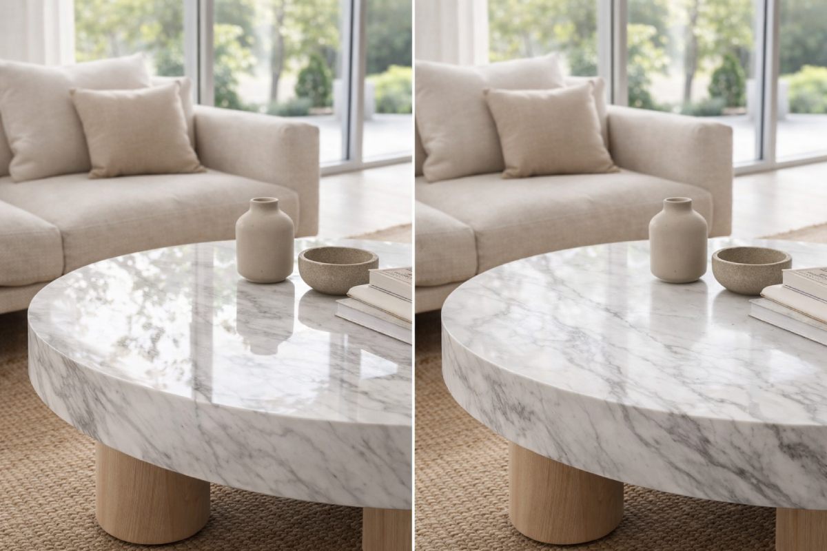
This is where projects win or die, and it’s why honed vs polished Statuario marble matters more than people admit. Polished stone acts like a mirror. In a room with big windows and direct sun, polished white marble can create hotspots, glare lines, and that “surgical brightness” nobody asked for. Honed finishes diffuse light. They don’t fight your lighting plan; they cooperate with it.
If you’ve ever walked into a bright room and felt like you needed sunglasses indoors, that’s your cue: you’re dealing with reflection, not “too much white.”
Dial 3: Contrast Budget (How Much Contrast the Room Can Spend)
Minimalism works because it limits competing signals. Every room has a contrast budget. If Bianco Statuario is bringing high-contrast veining, then your other elements should stay restrained: calmer wood grain, quieter fabrics, and metals that don’t scream for attention.
When the contrast budget is overspent—busy veining, bold terrazzo, heavy black frames, high-gloss cabinets—the room stops feeling minimalist and starts feeling like five strong opinions sharing one address.
A 60-Second Decision Test: Is Your Space Statuario-Friendly?
You don’t need a mood board to make a good decision. You need to understand the room’s light behavior.
If your room gets direct sun for hours
Prioritize white marble glare control. Bianco Statuario can still work beautifully, but it usually performs best as a honed surface on large planes. If you want polished, keep it on smaller vertical areas where glare is less aggressive, or balance it with matte cabinetry and warm textures.
If your room is naturally dim or often cloudy
Polished finishes can be your friend here. In low-light rooms, polished Bianco Statuario can lift the entire space and make a minimalist palette feel alive rather than flat. The key is keeping the veining scale appropriate so the stone doesn’t become the only thing you notice.
If your space is small
Go quieter. In compact rooms, dramatic veining reads louder, seams read more obvious, and reflection feels sharper. Use calmer slabs, a softer finish, and detailing that reduces visual breaks.
If your space is open-plan
You can use Statuario as a “spatial anchor.” A waterfall island, a fireplace surround, or a large feature wall can become the room’s visual structure—especially when the rest of the interior design stays calm and matte.
Bianco Statuario Marble Applications as Design Recipes (Not a Room Checklist)
This is the part where most articles become predictable. Instead, here are four repeatable “recipes” that work across projects. Each recipe is a practical Bianco Statuario marble application you can adapt to your interior design style.
Recipe 1: The Gallery White Kitchen
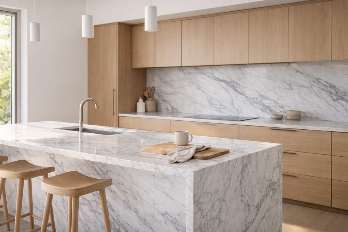
This is where Bianco Statuario marble kitchen backsplash design can look legendary—or look like a glossy showroom you’ll never relax in.
A gallery-white kitchen works when the stone creates order, not chaos. Consider Bianco Statuario as a clean canvas with controlled movement. Keep the backsplash height and slab layout intentional so the veining looks composed rather than random. If you’re doing full-height stone, plan the veining direction so it supports the kitchen’s lines—vertical veining can make the space feel taller, while horizontal flow can make it feel wider.
The best minimalist kitchens with Statuario usually share the same supporting cast: matte cabinet fronts, low-sheen paint, warm wood accents, and hardware that doesn’t reflect like a tiny disco ball. If your stone is polished, let your cabinets be matte. If your cabinets are glossy, consider honed stone. You’re balancing reflection like a sensible adult, not stacking it like a toddler with blocks.
Recipe 2: The Soft-Spa Bathroom
Bianco Statuario marble bathroom interior design can feel spa-like, warm, and serene—if you avoid the “clinical white tile” trap.
The spa version is all about softness: honed finishes, warm lighting, and fewer harsh contrasts. When the room is small, keep veining quieter so the marble reads as calm, not busy. If you want the stone to feel luxurious instead of cold, introduce warm elements that don’t compete: light oak, brushed metal, textured towels, and wall lighting that creates a gentle gradient rather than a harsh spotlight.
In wet areas, reflection isn’t just an aesthetic issue; it affects how water lines and soap residue show. A honed surface tends to hide daily life better in shower zones and around sinks. Polished can still work, but it’s less forgiving when you want the room to look effortless.
Recipe 3: The Quiet Statement Fireplace
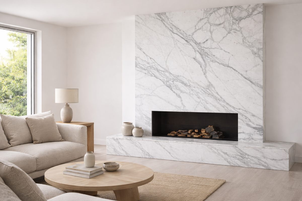
A fireplace surround is one of the smartest Bianco Statuario marble applications for minimalist interior design, because it naturally becomes a focal point. The mistake is adding other “focal points” nearby and turning the room into a competition.
Let the stone do the talking: keep surrounding materials quieter, use a restrained mantel profile, and avoid high-contrast clutter on the hearth. If you choose a bookmatch Statuario marble wall effect, commit to symmetry and align the veining so it looks purposeful. Bookmatching is like eyeliner: done well, it’s iconic. Done poorly, it’s all anyone can look at—and not in a good way.
Recipe 4: The Warm Minimal Entry That Doesn’t Feel Cold
Entryways are where people decide if your minimalist home feels welcoming or sterile. White marble can easily lean “cold,” but Bianco Statuario gives you a built-in solution: it has movement and softness in the veining.
To make it warm, pair the marble with one or two tactile, quiet elements: a matte wood bench, a textured runner, or a softly lit wall surface. Keep the palette restrained, but not lifeless. Minimalism is not a punishment. It’s just a refusal to keep things you don’t love.
Finish & Detailing: Where Minimalist Projects Win or Die
Even the best slab choice can look mediocre if the details aren’t tuned for minimalism.
Polished vs Honed: Decide by Glare, Not Taste
Honed vs polished Statuario marble isn’t a style debate; it’s a performance decision. Polished increases perceived brightness and contrast. Honed reduces glare and makes the room feel calmer, especially under strong natural light.
If you’re chasing “bright minimalist,” honed is often the safer default for large horizontal surfaces. Polished can be spectacular on vertical elements or in spaces where the light is softer. The most cohesive minimalist interiors often mix them strategically rather than forcing one finish everywhere.‘
Grout Strategy: Two Safe Choices
If you care about the clean, continuous look, grout is not an afterthought. The best grout color for Statuario marble is usually one of two options, depending on your goal.
A white grout creates the most seamless field and keeps the space feeling airy. A soft grey grout makes maintenance feel easier and can visually connect with the veining. The wrong grout—too dark or too warm—can chop the surface into a grid and pull attention away from the stone’s natural flow.
Seam & Vein Alignment: The Minimalist Rule
Minimalist spaces are less forgiving of misalignment because there are fewer distractions. A poorly placed seam becomes the loudest “design feature” in the room, which is… not the dream.
Plan seams like you plan lighting: intentionally. Keep them away from the most visible focal zones when possible, align veining across joins when the application demands it, and use the room’s geometry to hide transitions—behind fixtures, at corners, or where natural breaks already exist.
Real-Life Care: Minimal Routine, Maximum Brightness
Bright marble doesn’t need you to become a full-time caretaker. It needs you to understand what actually changes its appearance.
Etching vs Staining: What You’ll Notice
Most people worry about stains first. In many real kitchens, marble etching in kitchens becomes the more noticeable issue. Etching is a change in the surface caused by acidic substances—citrus, vinegar, wine, certain cleaners. On white marble, etching can show as a dull spot in raking light.
Staining is about pigments and oils penetrating. It’s less inevitable than people assume if you use the right finish, seal appropriately, and wipe up common culprits promptly.
The Habits That Matter (Without Turning Your Life Into a Checklist)
Treat the marble like you treat a good white shirt: don’t panic, just don’t be careless. Wipe spills sooner rather than later, avoid acidic cleaners, and don’t let puddles become a lifestyle. In bathrooms, a quick wipe-down after heavy use keeps water lines from building up. In kitchens, use trivets and boards where acids and oils are common. Simple, boring, effective.
If minimalism is the aesthetic of fewer objects, good marble care is the habit of fewer dramas.
Buyer Spec Sheet: Copy-Paste Notes to Send Your Supplier
This is where many projects become smoother. If you want consistent results, specify clearly. These Statuario marble slab selection tips are written to be shared directly in procurement conversations, especially when the marble is being used in bright minimalist interior design.
Slab Selection Notes
Ask for consistent background tone across the batch, with veining intensity aligned to your design goal (quiet, moderate, or statement). Confirm whether you want softer movement or dramatic strokes, and request photos under neutral lighting. For minimalist spaces, prioritize slabs that look harmonious as a group, not just beautiful individually.
Cut Plan Notes
Specify where you want veining direction to flow (vertical, horizontal, centered), especially for feature backsplashes, waterfall panels, and fireplace faces. Confirm seam placement expectations and whether you require veining continuity at key joins.
Acceptance Notes
Natural stone has variation. Define what you consider acceptable in terms of veining distribution and shade difference, and what you consider unacceptable (obvious discoloration, disruptive patches, or mismatched tone across installed surfaces). The clearer this is upfront, the fewer “surprises” later.
A light touch on buying intent: if you’re evaluating a Bianco Statuario marble supplier or a Statuario marble slab manufacturer, the best indicator isn’t a sales promise—it’s how well they support slab selection consistency, cut planning, and pre-install alignment checks for minimalist interior design applications.
FAQ
Is Bianco Statuario marble too bright for small minimalist rooms?
It can be, if the finish is highly reflective and the veining is dramatic. In small rooms, choose quieter slabs and lean toward honed finishes to keep brightness soft rather than harsh.
Honed or polished Statuario marble for bright minimalist interior design?
Choose based on light. Strong direct sun usually favors honed for glare control. Dim rooms or soft indirect lighting can benefit from polished to lift brightness and contrast.
What are the most practical Bianco Statuario marble applications for beginners?
Backsplashes, fireplace surrounds, and vanity tops are often easier to control visually than full-room flooring. They let you enjoy the marble’s character without committing the entire space to a high-reflection surface.
What is the best grout color for Statuario marble in minimalist spaces?
White grout gives the most seamless look; soft grey grout often feels more forgiving and aligns naturally with the veining. Avoid strong contrast grout if you want a calm, continuous surface.
Does marble etching in kitchens ruin the minimalist look?
Not necessarily. Light etching can be subtle and can even blend into a lived-in, natural aesthetic. If you want the surface to look pristine under strong light, choose a honed finish and avoid acidic cleaners to minimize visible etching.
Conclusion: Bright Minimalism With Built-In Order
Bianco Statuario marble interior design works best when you treat it as a system, not a decoration. Tune the three dials—vein noise, reflection, and contrast budget—and the marble stops being “just white stone” and becomes the structure that makes bright minimalist interior design feel intentional. Use Bianco Statuario marble applications like recipes, detail the seams and grout like you mean it, and pick finishes based on real light behavior. Done right, the result isn’t overwhelming. It’s quietly bold—exactly what minimalism is supposed to be.
FAQ
1. Is Bianco Statuario marble good for kitchen countertops in minimalist interior design?
Yes—Bianco Statuario can work extremely well on countertops in bright, minimalist interior design, especially when you manage light and daily-use risk. Choose the finish based on your room’s sun exposure: honed often looks calmer in strong daylight, while polished can lift dim kitchens. The practical key is treating the countertop as a “work surface” rather than a museum piece: wipe acidic spills quickly, use cutting boards under citrus and vinegar-heavy prep, and avoid harsh acidic cleaners. With the right finish and habits, the marble stays bright and refined without feeling fragile.
2. Can you use Bianco Statuario marble in a shower or wet bathroom zone?
You can, but the success depends on finish choice, detailing, and how you expect the bathroom to be used. In showers and wet zones, a honed finish is often more forgiving because it diffuses reflections and hides water spots better than polished. Plan drainage and ventilation seriously, and keep the detailing minimalist but smart: reduce unnecessary seams, align veining where it matters most, and choose a grout tone that supports a continuous look. If you want the space to feel “soft-spa” rather than “clinical,” pair the marble with warm lighting and quieter surrounding materials.
3. How do you clean Bianco Statuario marble without dulling the surface?
Use gentle, pH-neutral cleaning habits and avoid products that are designed to “cut” limescale or grease aggressively. For daily cleaning, a soft cloth with mild, stone-safe cleaner is usually enough, followed by a quick dry to prevent water marks—especially in bathrooms. Avoid acidic or abrasive cleaners, because they can create dull spots that show under raking light (often described as etching). The most effective routine is boring on purpose: gentle clean, quick dry, and consistent prevention of harsh chemical contact.
4. Does white Statuario marble turn yellow over time in bright spaces?
It can appear warmer or slightly yellowed over time, but it’s usually not the stone “changing color” in one simple way—it’s more often a combination of lighting temperature, surface residue, and aging of surrounding materials. Warm light bulbs, airborne cooking oils, and certain waxes or film-forming products can shift how the surface reads. In bright minimalist interiors, you’ll notice this sooner because the palette is so clean. The fix is typically straightforward: keep care products stone-appropriate, avoid coatings that leave a build-up, and check your lighting temperature before assuming the slab itself is the problem.
5. How often should you seal Bianco Statuario marble for interior design applications?
Sealing frequency depends on finish, usage, and exposure to staining agents. As a practical baseline, many homeowners and commercial spaces review sealing about once a year, while high-use kitchen areas may benefit from more frequent checks. Honed surfaces can be more absorbent than polished, so they may require closer attention in kitchens and vanity tops. The simplest way to decide is performance-based: if water no longer beads and darkens the surface quickly, it’s time to reseal. Sealing helps with staining resistance, but it does not “prevent” etching from acids—so daily habits still matter.
References
-
Marble and Limestone Care & Maintenance — Technical Team — Natural Stone Institute — Technical Bulletin / Maintenance Guidance
-
Dimension Stone Design Manual — Technical Committee — Marble Institute of America / Natural Stone Institute — Design Manual
-
TCNA Handbook for Ceramic, Glass, and Stone Tile Installation — Editorial Committee — Tile Council of North America (TCNA) — Annual Handbook
-
Stone in Wet Areas: Detailing and Maintenance Guidance — Technical Advisory Group — Stone Federation Great Britain — Industry Guidance Note
-
ASTM C97/C97M: Absorption and Bulk Specific Gravity of Dimension Stone — Committee C18 — ASTM International — ASTM Standard
-
ASTM C241/C241M: Abrasion Resistance of Stone Subjected to Foot Traffic — Committee C18 — ASTM International — ASTM Standard
-
ANSI A108/A118/A136.1: Specifications for Installation Materials and Methods — Accredited Standards Committee — American National Standards Institute (ANSI) — ANSI Standard
-
Floor Slip Resistance: Guidance for Pedestrian Surfaces — Workplace Safety Specialists — UK Health and Safety Executive (HSE) — Safety Guidance Publication
Insight Hub
How does Bianco Statuario keep minimalist spaces from feeling empty? It introduces structured movement through veining, giving the eye a quiet focal path while preserving negative space. When the veining scale is matched to room size, the stone reads as architectural “composition” rather than decorative “busyness.”
Why does finish choice matter more than people think? In bright rooms, polished surfaces can create hotspots and glare that amplify perceived clutter and make a space feel clinical. Honed finishes diffuse reflections and often deliver the softer, gallery-like calm that minimalist interiors aim for, especially under strong sun exposure.
What are the best options for real-world applications? Targeted placements typically perform better than “all-over marble” in minimalist homes. Backsplashes, vanity tops, and fireplace surrounds give maximum aesthetic return with fewer maintenance trade-offs, while large floor or full-wall applications require stricter control of slab consistency, seam planning, and lighting geometry.
Option deep dive: polished vs honed in bright minimalist interiors Polished can elevate dim spaces by boosting light bounce and crispness, but it demands tighter glare management and can reveal water marks and surface changes more readily. Honed tends to look calmer across different lighting conditions, hides everyday residue better, and fits the soft-spa and Scandinavian/Japandi direction without sacrificing the signature Statuario identity.
Consideration deep dive: seams, grout, and “visual breakpoints” Minimalist rooms are unforgiving: seams and high-contrast grout can become the loudest element in the space. The most “expensive-looking” outcome often comes from continuity—aligned veining across key joins, seam placement away from primary sightlines, and grout tones that either disappear into the field or harmonize with the veining.
What should buyers specify to reduce risk? Procurement clarity is a performance tool. Define the desired veining intensity, background tone consistency across the batch, preferred veining direction for feature areas, and acceptance criteria for natural variation. This reduces on-site surprises and protects the minimalist intent where small visual disruptions become disproportionately noticeable.
Trend and market insight: why “controlled brightness” is winning Globally, bright minimalist interiors are shifting from high-gloss, high-contrast “showroom white” toward softer, more tactile finishes that photograph well, feel warm, and age gracefully. That trend favors honed and low-sheen surfaces, careful material pairing, and design decisions that prioritize calm readability over maximum shine.
Maintenance reality check: what sealing can and cannot do Sealing supports stain resistance, but it does not stop etching from acids—so the smartest approach combines gentle, pH-neutral cleaning with habit-level prevention. In practice, the most durable minimalist look is built from consistent daily care, quick drying in wet zones, and finish choices aligned to how the space is actually used.